

Some people have called it a ‘reset’ for the way we live our lives. Inevitably “Lockdowns” have forced us to pause, reflect, and consider what truly matters most for our own wellbeing and the wellbeing of others.
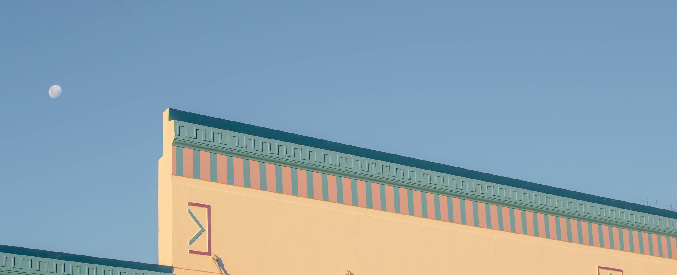
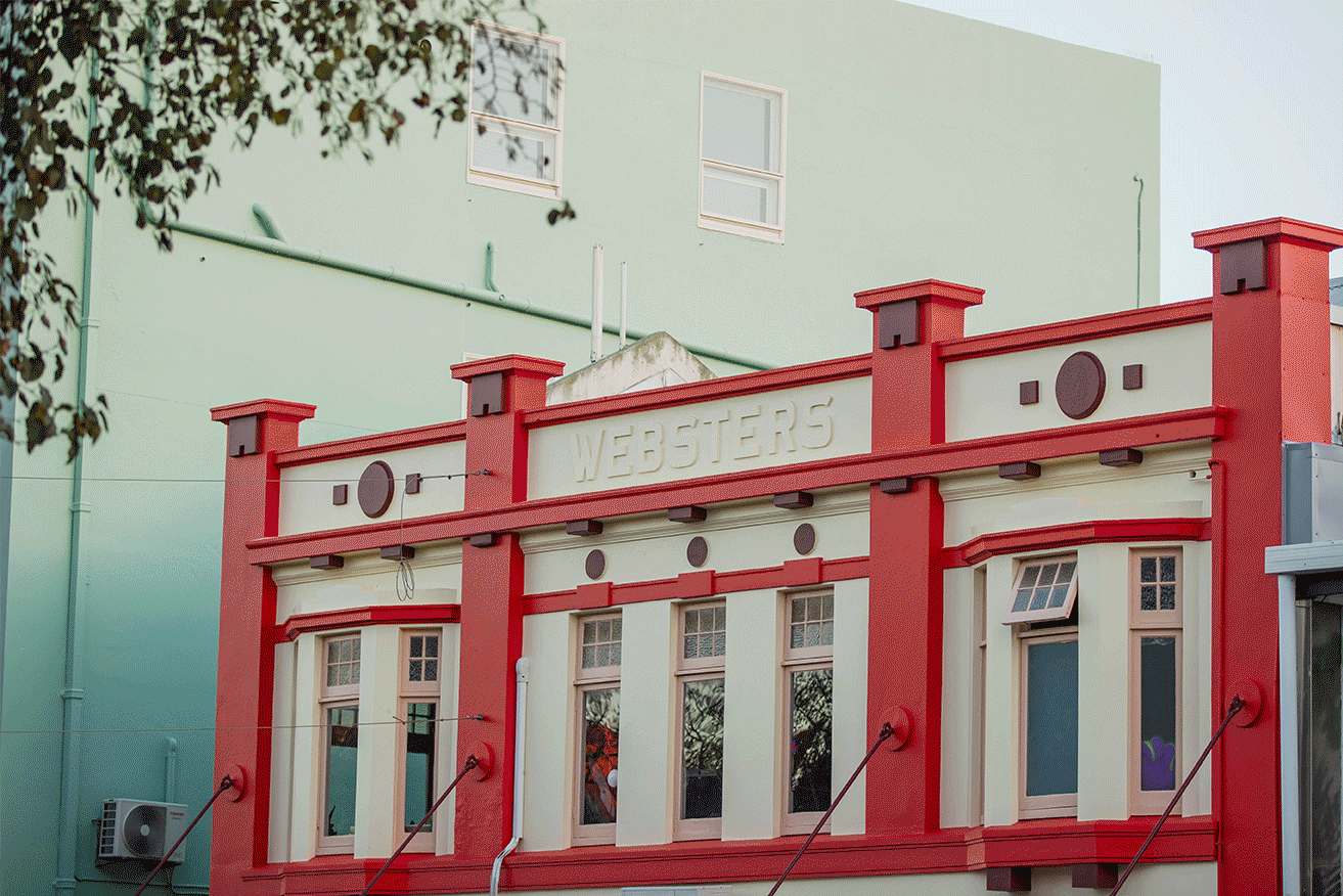
Central and local government moved quickly post NZ’s first full lockdown, implementing recovery packages and policy, with a focus on stimulating the economy and creating jobs. In New Plymouth part of that aforementioned package focussed on brightening the main streets of our CBD’s, and stimulating the beginnings of a city transformation.
New Plymouth’s CBD building facades are reminiscent of a mash-up of architecture spanning decades and various retailers’ existence here once upon a time. Designer – Jeanette Trewin was tasked to envision colours that would breathe new life into those very buildings.
The impact of colour has long been recognised as an important psychological factor in both architecture and design: colours can exert influence on people’s mental wellbeing, an effect that is particularly relevant to designers in creating spaces that attract people. Jeanette has answered some questions about colour that might inspire your colour journey, or simply explain why the buildings of the main street have changed colour recently.
Here are some of the schemes Jeanette put together and Q & A with her below.
Q. How do you approach colour in architecture?
A. Historically New Zealand Architects have been tentative with the use of colour. My view on colour is that it should be applied to buildings to create a human response. Colour has the ability to create and exhibit culture while stimulating an emotional connection to the spaces and places we inhabit daily. With this in mind, colour definitely has an impact on our experience of spaces, and depending on the function of the architecture the absence of colour can sculpt our experience just as much, for example, art galleries, crematoriums, or places of worship. I really enjoy using timber, or brick, or plant life where possible as a way to bring in colour naturally as opposed to artificially, which can sometimes be more effective, especially in educational facilities with learners who need a settled environment to concentrate in.
Q. Where do you start when reinventing a space?
A. When reinventing a space I find it helps to look straight to the proposed functions of the space, and other opportunities presented by the existing qualities of the space, entry of natural light, access ways and any indoor/outdoor relationships. When reinventing a space it’s always a great time to reflect on what you really need out of the space, and whether it’s achieving that.
Q. Who inspires you chromatically?
A. I have always been inspired by the freedom of colour in installation design, one of my favourite artists who uses colour with an acute understanding of the human eye is Icelandic-Danish artist, Olafur Eliasson
Q. What is your favourite colour right now & why?
My favourite colour right now is caramel pink, it’s a colour I’m seeing more and more frequently trending in fashion, it’s not quite floral and it’s not quite terracotta. I like the earthy undertones that feel relaxed and natural, but it also has a richness to it that feels sophisticated and refined.
Q. What has been cool about working on the facades with various landlords of New Plymouth’s main street?
A. It has been very cool experiencing the behind-the-scenes organisation, working with landlords + council and with colour as the tool to reinvent the main street (the brief is vibrant, contrasting!), it has been very cool to see some of these sometimes “head-turning” schemes come to life and contribute to the current urban and historic context of New Plymouth’s CBD.